Wonder Coffee
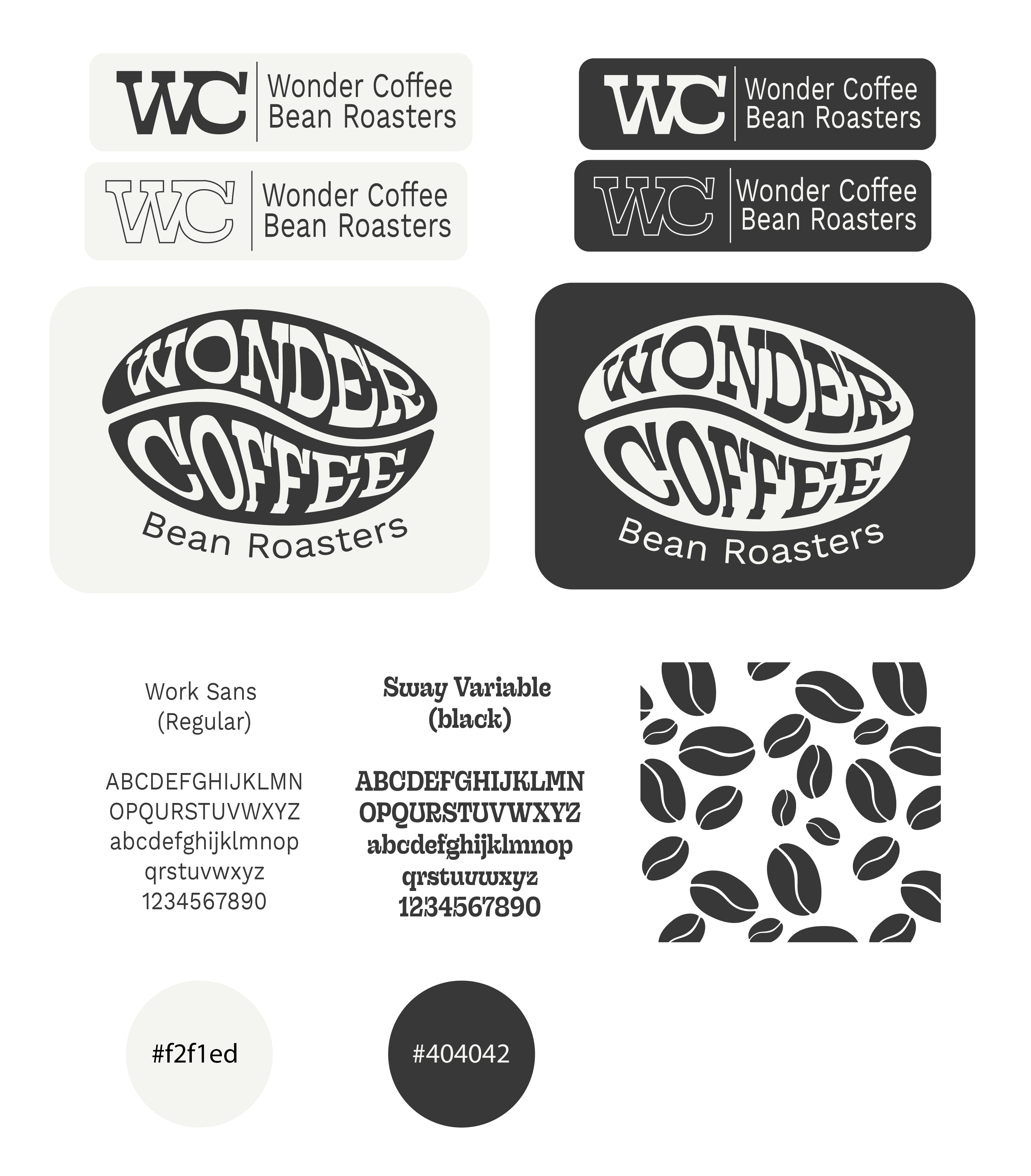
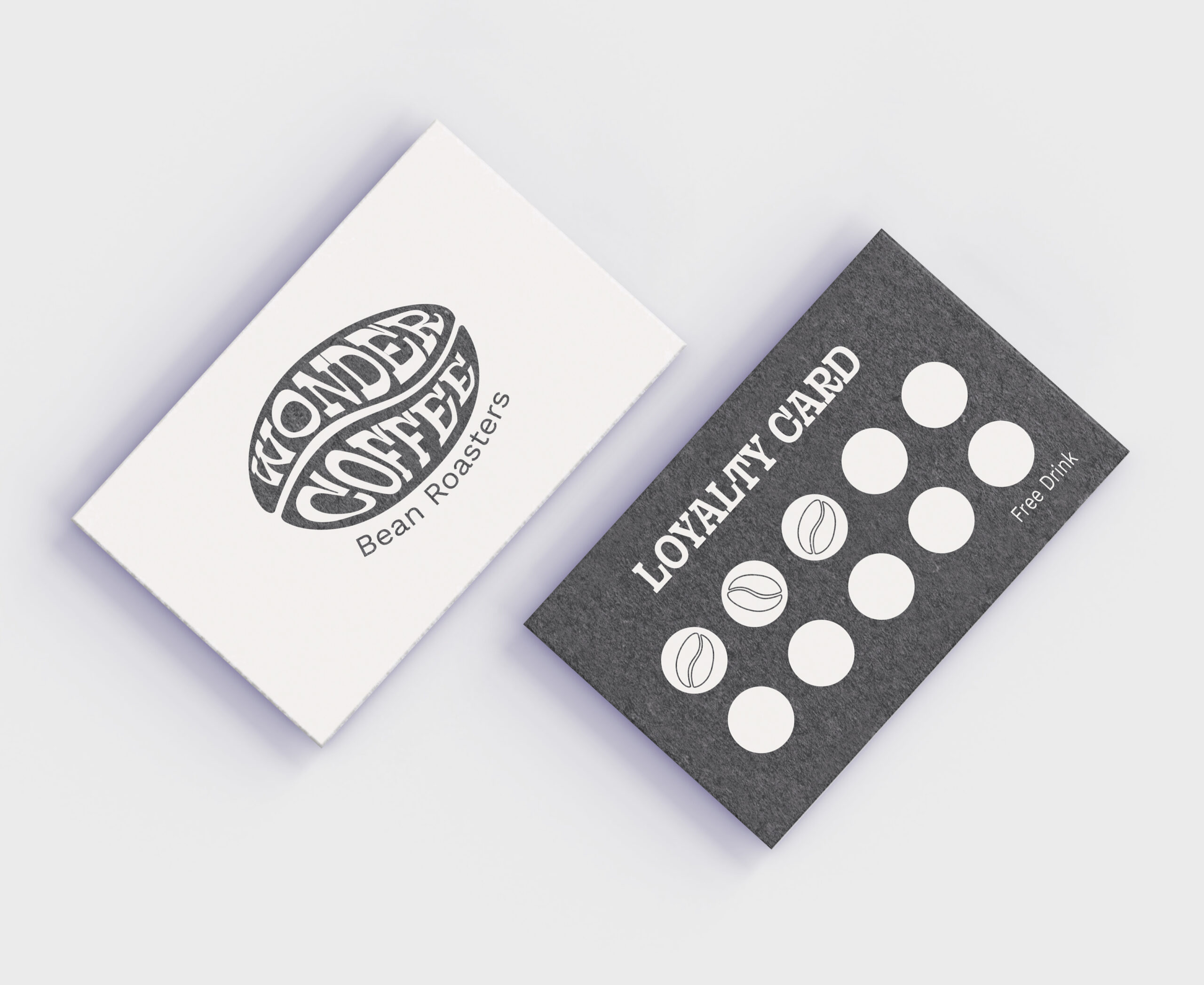
I developed a coffee brand called Wonder Coffee. Aiming to capture a relaxed, beach-inspired vibe, I designed a logotype that fits seamlessly into the shape of a coffee bean, giving the brand a unique and memorable identity. The simple color palette brings a soft, refreshing aesthetic, reflecting the laid-back coastal atmosphere. This design approach enhances Wonder Coffee’s approachable and inviting personality and resonates with coffee lovers seeking a taste of relaxation and simplicity with every sip.


The Challenge
Starting the project from scratch presented several unique challenges. One of the first was conceptualizing a design that captured a distinct coffee identity while maintaining a clean and minimal aesthetic. I wanted the logo to feel organic yet recognizable, being simple without losing character. Refining the logotype into a coffee bean shape required multiple iterations to maintain readability while preserving the form.
Another challenge was committing to a black-and-white color palette that remained bold and timeless. Stripping away additional colors meant relying on strong contrast and clean typography to ensure visibility across various mediums. Every design element needed to feel intentional, from the logo to the overall brand voice, which I aimed to keep modern, inviting, and effortlessly sophisticated.
I developed a brand that aligns with my vision through careful refinement and attention to detail—simple, striking, and unmistakably Wonder Coffee.


